Cheers!
Monday, January 9, 2012
500 HITS!
Cheers!
The Designer Is Always Right
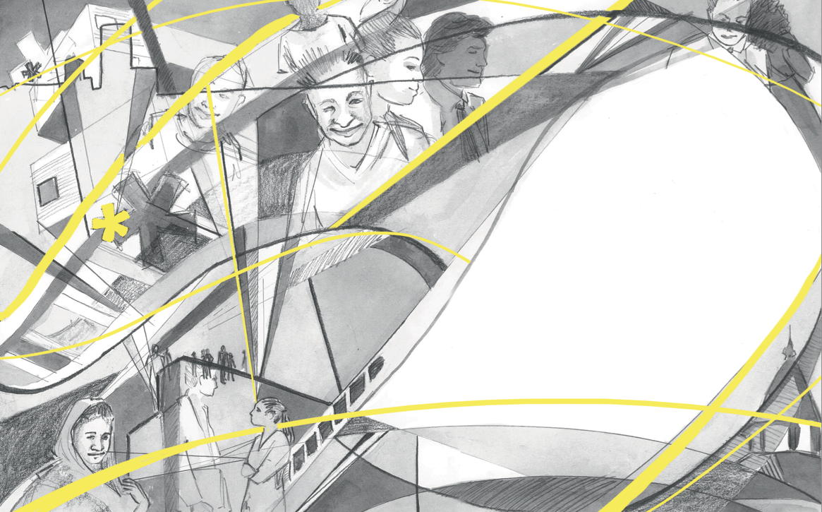
For the second project, we
worked with a group of seniors in the communication design department to create
an editorial illustration for an article in a magazine project they were
working on. We would create the illustration, they would place it, set the type
and do any other design things that needed to be done. The teachers of both
classes were working together as well and apparently they hand picked the
students depending on their style of design/art in the hopes that they would
create a good match. …I’m left to wonder if I was the last one on the list. Not
to say anything negative about the designer’s style, it really was pretty good
for what it was, but it was very clean and very Swiss with a very limited color
palette. …meanwhile I like lots of colors and lose lines with lots of
references to nature(for a start). So, what to do? The article was very
abstract and was essentially about empathy. The magazine was aimed towards
older, male architects. So I decided to try something that I did last semester and
print out a buch of photos and trace parts of them over each other to create
something more abstract and pattern-like. Black and white with a pop of yellow,
lots of movement—they loved it. I wasn’t too fond of it but when you’re working
for someone else, I suppose you can’t be in love with everything you do.


I will keep my ranting to a
minimum as it feels very unprofessional to badmouth someone I was working with
in public but I will say that it was not an entirely pleasant experience and I
hope my next time working this way goes a lot better. Like I said, you can’t
love everything you do and while I finished it and I think It looks good, this
piece is not me. Either way, I hope you enjoy.
Tuesday, December 20, 2011
Portraits
In illustration as the first
assignment of the semester, we had to create two portraits. One had to be of a
person in history who had been dead for more than a hundred years and another
more contemporary one. They had to have some sort of link, be it in appearance,
what they were known for or even sharing the same birthday. This was difficult
and honestly I probably spent way too much time thinking it over and
researching. Finally I settled on two: Aesop and Jim Henson. Both created well
known allegorical stories using animals and both are still very well loved
today (especially by children). There was also a certain amount of Henson mania
running through my head at the time due to the upcoming Muppet movie (which is
wonderful and everyone should go see).
Anyway, I wanted to showcase both portraits with the characters they
were known for, as they are just as important as the individuals themselves.
Here is what I cam up with for sketches:


I wanted them to both be lose
and fun but Henson I made with much brighter colors because, well, why wouldn’t
you? It just makes sense. Aesop was a much more muted partly to show that his
stories were much older, antique, and partly to show that there was not as much
of a concrete component to his stories. You read them or hear them and create
them in your head.
So there it is! First project of the semester! A
little rushed but I’m happy with it.
Thursday, December 15, 2011
Where Have All The Blog Posts Gone?
My, my, it certainly has been
a long time. I have neglected my blog since….March? Well, now that changes.
Prompted by a writing assignment (because dear gods if I had to write another
academic essay on another mundane topic I was going to snap) I will be updating
my blog quite a bit.
For a start, here is what you
missed in the almost exciting world of Megan: I finished my Sophomore year at
MIAD which, while I passed and was pleased with most of my assignments, was a
massive ball of stress and a last minute experience that I would rather never
repeat. Then I traveled to Ireland for a month! It was a most magical
experience that I will never forget. I
will make a post later about that, though. Then after the summer break, I
started my junior year at MIAD and here I am! Managing my time better,
developing as an artist (or at least I hope) and finishing all of my finals
without staying up all night at all! HA! But as a part of finishing said
finals, I should really get along with this blog this so on to the next post.
Wednesday, March 30, 2011
The Pardoner's Tale
As told in the format of skateboard illustration! Oh yeah, that's right: Chaucer on a skateboard! While I have some other, non-school related stuff that I plan to post soon, I just finished this project last night. ...And now I'm off to finish another assignment because MIAD's illustration faculty is conspiring against me ever getting a good night's sleep again.


Wednesday, March 9, 2011
The Creative Process
Between catching every flu bug in Milwaukee twice and a bit of a funk, I haven't gotten much done since my last post. At all. I have, however, managed to finish another illustration project for school. A bit rushed and I'm not the most proud of it but I still like the idea. Enjoy:

-Megan

-Megan
Tuesday, February 22, 2011
Illustration Frustration
Remember that poster project that I mentioned a while back? The one with the dog? Yes, that project just ended. From the beginning of the semester (January 18th) until yesterday (February 21st), when I handed it in. It will be sent off to an art contest and if it wins, will be auctioned off at the Penfield Children's Center 's annual croquet ball. Normally we are not given this much time for a single project but, due to mass amounts of snow and the client not being able to meet with the class when they had planned, we were granted a lot of extra time. Because we had so much time to work on it, the poster also had the opportunity to go through many, many, many changes and three critiques. Now, normally I am not one to complain about having too much time (quite the opposite, actually) and while I will say that it was an excellent learning experience to actually interact with a real client, this got to such the overwhelming point that I was ready to hand anything just to be done! Even now, while I am proud of the outcome, it feels overworked and I never want to lay eyes on it again. So, as a final fairwell and a bit of venting, I give you my Croquet Ball poster in its many shapes and forms.
First we have the tight sketch, color samples and a bit of rough type. At this point I really thought I was on to something and was going for a sort of "retro" asthetic.


I was told to abandoned the curved type and stick to the more blocked out version above. Also to try and do something more drastic and unexpected with the colors. Okay, fine, that sort of throws my original "retro" idea out of the window but hey, time to try something new. Still optimistic, I changed the colors around and added the rest of the text for the poster in a similar style to the tag-line which brought about what you see below.


The critique with the client went well but they hated the text--it was too big and looked like a magazine cover instead of an artsy poster. Then they were not nearly as amused as I was by the fact that the font I was using is actually called "impact" (yes, yes, also famous for lolcats captions...I still thought I was being amusing). The color of the grass was also an issue as it looked "too dead" and blended into the sky too much. "I know it's cliche but, why don't you try just making the sky blue and the grass green?" So much for bold and unexpected colors. Not only that but the illustration needed something else to it and the dog was getting a bit lost in the picture plane. Fair enough. Then I sketched out a new version and threw together some new colors.


Finally, I thought, I am almost done. I brightened the colors, fixed the text and made the dog bigger and more interesting. Almost there! ...Sadly, this was not the case. I wish I still had a copy of the color sample that I sent to my teacher and was told that it looked like "the Golden Girls or the inside of a Taco Bell". Ouch. So I abandoned the odd colors. While the font was widely accepted with just a few minor adjustments, the colors were (once again) "too expected" (GAH!!!) and the dog still did not take up enough of the picture or make it interesting enough on its own. It was suggested that I add a rotund figure chasing after him with a mallet for comedic effect. That or more animals. As I was not quite comfortable with the first option, I opted for the second and, while fighting the urge to hurl my computer out of a window, added some other long animals. At this point had completely abandoned my original idea and was ready to hand in whatever I could turn out in a weekend.


And there you have it: the finished poster! Mind you, this was after thinking I had lost my most recent, most finished file and would have to start from scratch the morning it was due. I almost started crying. Fortunately, I have awesome beyond awesome friends and the file was waiting on the computer at school when I got there that morning. -sigh- What a marathon of a project.
As I have said, I am still pleased with the outcome and this was quite the learning experience. Never the less, it was not gained without a lot of hard work and frustration and I believe that deserves a good rant (that and I thought it would be interesting to my few readers to show the process of a piece from beginning to end). Just a taste, I expect, of what is to come as a professional commercial artists. . Just a taste, I expect, of what is to come as a professional commercial artists.
-Megan
Subscribe to:
Posts (Atom)